It took more than an hour to watch this video on Designing Data Visualizations. Every minute was worth it. While I knew a bit about the subject, this talk walks you through the elements of visualization and how to go about designing one. There is a lot to learn from this talk and later from the book:
- Types of Information Products
- Difference between Infographics and Visualizations
- Choice of Visualization elements
- A walk through of few visualizations
- How to go about designing a visualization
Here are few screen shots from the talk.
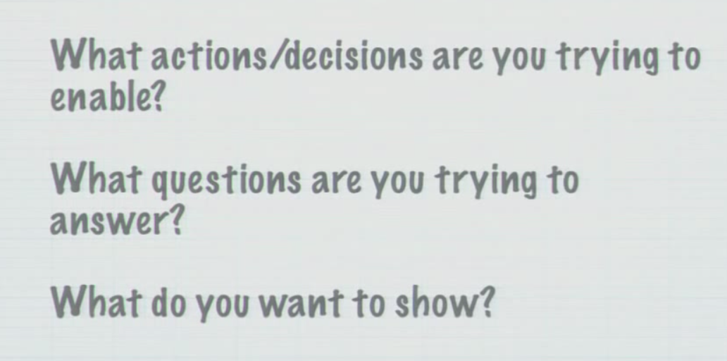
At a high level, you need to understand:
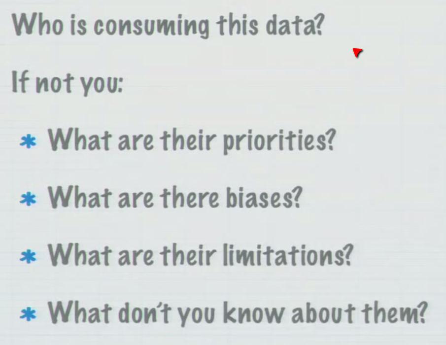
Then you focus on the user.
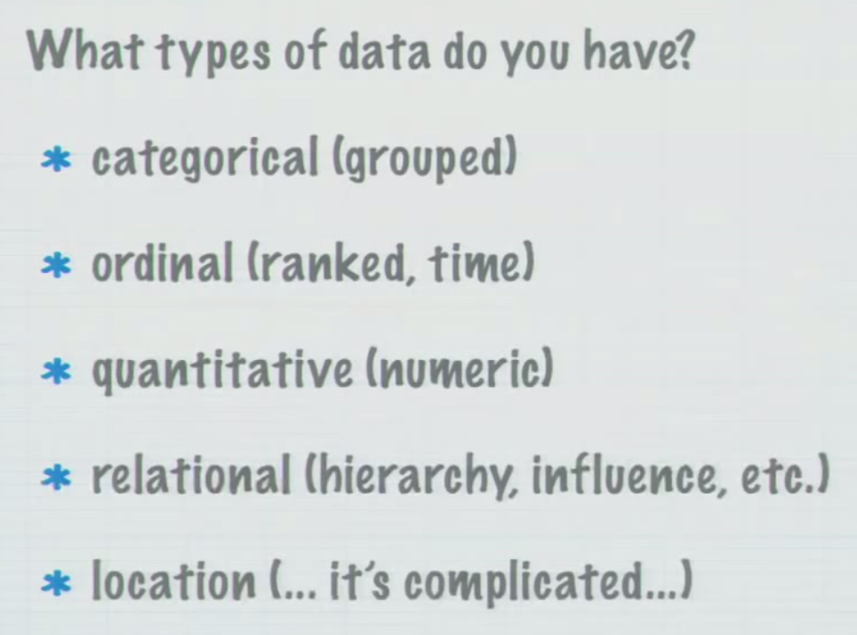
Paying attention to the data you have to work with helps.
These slides are just a small sample. They will give you an inkling about the approach. For all the good stuff, please watch the video and then get this book.
From the Preface of the book:
The path from journeyman to master is long. In the case of data visualization, the path has been well marked by many accomplished designers and cognitive scientists who have been doing great work for decades. We gladly follow in their footsteps, and we hope you will, too.
Our goal is to give you confidence as you begin your journey.
Meta
Thank God that there is internet that enable tools like YouTube which provide acess to channels like LinkedIn Tech Talks who bring you people like Noah to share their knowledge.
2 thoughts on “A Few Slides on Designing Data Visualizations”
Reblogged this on Thoughts and commented:
Nice blog on Data Visualisation. For all those who are working hard on creating Infographics, this is a very good resource.
Thanks Vivek.
Comments are closed.